Impressions on site
A Celebration of Colours

An awe-inspiring palette of mix-and-match shades for the murals in Delhi and Chennai.
By Faizal Khan
Delhi is getting ready to celebrate Holi in a few days. But for the Lodhi Arts District, the Festival of Colours may have come a little early.
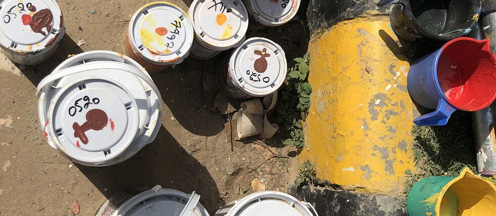
The two artists spearheading the Graphic Travelogues Murals project in Delhi and Chennai have used a whopping thirty-seven shades of colours to create two massive murals. A lot of research, sampling, and weeks of back and forth email and text messages have gone into the painstaking selection of the palette.
Aashti Miller and Greta von Richthofen have chosen 14 shades for Delhi and 23 for Chennai. Six colours are common for both cities. "Initially, there were 35 colours for Chennai alone," says Miller. "We narrowed it down to 23." The names of the shades vary from brick pile to deep spice, timber ridge to malabar hills, and rain drop to raven song.
It all began back in December last year. The artists had a good look at the walls they were going to paint on before the process of choosing the right colours for the murals began. "We received photographs of the walls in December," says von Richthofen. "We also received the size and measures of the walls," she adds.
The massive size of the walls and a potpourri of objects making up the murals mean a sizeable volume of paint too. The mural in Delhi is going to measure about 100 feet wide and 35 feet high when completed. In Chennai, it is 39 feet wide and 43 feet high. The murals take up almost the whole space of the walls in both Delhi and Chennai. "We chose colours to relate to the mood. These are not dark, but light colours. We especially love yellow," says von Richthofen.
The colour of the base paint on which the artists work is continental green. Described as a colour like the majestic evening sky, continental green formed the perfect base for the artists to begin their work. "We wanted to pick up some vibrant colours relating to Delhi," explains Miller. "We received photographs of walls in Delhi and even those of colourful clothes common in the city," she adds.
The artists consider their choice for Delhi and Chennai as a two-tone colour palette. The tone is pink and blue for Delhi, and orange and blue for Chennai. "Both Delhi and Chennai are very colourful," says Miller. Among the shades for Delhi is malabar hills, which is a mix of red, green and blue. Rain drops, another shade, is characterized as airy and playful. The shade timber ridge, a green-blue concentration, is meant to evoke freshness and harmony.
To top the paint swatches is another "natural shade". This natural shade on the stock is, in fact, the much-needed shade offered by the branches of a nearby peepal tree extending over the wall. "The branches offer us protection from the sun," says von Richthofen. "We have also named the shade," adds Miller. It is unlike other names on the palette such as light ochre or orange vision. It is just “tree.”
Comments
Comment